Monday, November 24, 2008

Japan has Flavor


I went to one of my favorite stores in Melrose Avenue (Los Angeles) "SELECTA". Selecta sells exclusive apparel, rare-collectible items (Steve Urkel Doll & R.O.B Nintendo robot) and a good selection of music. As usual, I walked toward the back to talk to my good friend DJ Yoshi, on the latest music releases. As we were talking I couldn't stop staring at the bottle he was drinking. The bottle looked similar to one of those Aloe Vera Juice drinks that my mom loves to drink. The thing that caught me off guard was that it had the Pepsi logo. To my surprise I found out that Yoshi was drinking none other than Ice Cucumber-flavored soda. He told me he got a whole case from Japan...

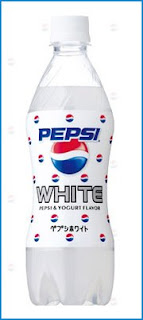
Apparently, in the summer of 2007, Pepsi not only released the Ice Cucumber flavor, but they also released Pepsi White (Half Pepsi/Half Yogurt drink) to the Japanese market. Even the man himself, Chester Cheetos changed its flavor earlier this year in Japan by going from Flaming Hot to Strawberry and Chocolate... Japan offers a variety of Kit-Kat flavors, the Kiwi Kit-Kats are good.... This shows how different cultures have different tastes.

The packaging on the Ice Cucumber is very modern, refreshing in color and eye catching. It surely worked on me, because I couldn't stop staring at it, maybe because I hadn't seen it before maybe...Pepsi needs to work on the design for the Pepsi White it simply looks nasty.

I'm not sure if the Ice Cucumber-flavored drink would be popular in the U.S. I guess this is how the people in Japan keep cool in the summer....

Rumor has it that Pepsi is going to release Hot Dog flavored Soda exclusively for South Central L.A liquor stores. Are you ready for the Pepsi Challenge?

Thursday, November 20, 2008

Time in Color


The Pantime Clock is a student project, designed by James Beattie from Bedford College, UK. The Pantine Clock is an interesting way to replace traditional clock numbers with different colors that correspond to Pantone Matching System numbers, starting with "012 C" (Pantone # for Yellow). Now, Graphic Designers, Printers and Artists can match the colors to its respective number from the Pantone Matching System.

It would be hard for me to tell time just by looking at the Pantime Clock. James Beattie, should make a 365 calendar by using the same system....

Wednesday, November 19, 2008

LMFAO Album Covers....


Over the weekend I went to my favorite music store Amoeba (Hollywood) located on Sunset Blvd between Ivar and Vine Avenue. As I was digging through some Records in the SOUL section. I came across Millie Jackson's 1989 Album "Back to the S_ _ T!", I seriously thanked graphic designers for coming a long way... The cover has Millie Jackson sitting down on a toilet bowl with her panties hanging down to her ankles, with a facial expression only a toilet can make you do...

Here's a couple of other memorable-funny album covers. These are some of the worst album covers that have ever been designed. Bad design and typography is everywhere, but these album covers have crossed the line!!!

"Zip Zap Rap" by Devastatin Dave was a single released in 1986. The single is an anti-drug song, released during Ronald Reagan crack-cocaine era. Check out the CMYK color scheme.

Knorkator-Hasenchartbreaker is an album by a German heavy metal band, released in 1999. Bad Image and terrible typography used

Ken-By request Only, released in 1976. This record sold for $150 on eBay.

Norberto de Freitas-Trapalhadas do Balbino... All I could say is Woow..

King Obstinate-25th Anniversary, released in 1983.

Monday, November 3, 2008

Eye exam...


This is the new DMV eye exam test. j/k.....
Can you read what it says????


(Hint: Don't look that close)

The Moment of Truth...


We have come to the final day of the political race that will shape our nation's history on same-sex marriages, animal rights, and will determine the next 44th U.S President. Remember the choice is yours, go out and vote like the poster above.....

I found a couple of posters:

"Vote", is a powerful poster it uses sans serif typography to create the shape of a thinking bubble. There's a mix of type styles and sizes. The overlapping and type size change used in this poster is a common technique used in advertising posters.

"Mc Cain I am Bush", was created after October 15th 3rd Presidential debate. When Senator Mc Cain told Obama, " Senator Obama, I am not President Bush". Classic Quote by Mc Cain.

"Nope Sarah Palin", is a parody of Shepard Fairey's Hope poster, notice the filters in this image.

Can you read what it says???? It's a poster by Lance Wyman, reminds me of an optical illusion.